Design

Way2net awarded as Top Digital Marketing Agency in Argentina

Way2net awarded as Top Digital Marketing Agency in Argentina

Way2net is a digital marketing agency, specialized in e-strategy planning and business development, digital marketing, online advertising, web optimization, social media, web design, and development. We are a Google Partner Agency certified by Google Inc. and we offer a wide variety of services including digital strategy, social media marketing, and advertising.

Clutch recently announced the top digital marketing agencies in Argentina. We are excited to announce that Way2net has made the list on their directory.

Way2net awarded as Top Digital Marketing Agency in Argentina

Clutch is a B2B market research firm located in Washington DC that connects service providers and buyers through data and verified research. Central to their process is client reviews. In this unique process, analysts have spoken directly with many of our clients and learned more about the services we provided, as well as technological capabilities, results, and business acumen.

Our clients’ participation made this award possible, and we want to thank them for their time and honest feedback. Below is are excerpts from recent reviews, along with project summaries:

“We continue working with them because of their thoughtful service.” –Marketing Coordinator, Synthon Bagó

Our team was hired to develop a pharmaceutical company’s marketing strategies. We work with different social media channels, crafting campaigns. We also worked on their site.

“With Way2net Digital Marketing Agency, we found a mix of business expertise and digital experience.” –Founder, Delbazar

We provided a variety of digital services for an online store. Our team developed an e-commerce website and social media campaigns

Digital marketing has forever changed how companies attract customers and generate revenue. If you’re considering hiring an online marketing company to help you boost your brand image, position your company in search rankings, or manage your social media presence, The Manifest can help find a business to best suit your needs. The Manifest, an affiliate site of Clutch, lists top digital marketing companies in Argentina. Among top companies, the site also lists descriptions, projects, and awards for users to utilize.

Need advice in marketing and communication? We are experts in digital strategy. Contact us by phone or fill out the form on our website and a team member will be in touch shortly. We look forward to hearing from you and your team.


Comments about Instagram logo redesign erupt in social networks

instagram logotipo redesenho

instagram logo redesignWe were already hearing rumors that Instagram was working on the redesign of a new design for Android, but we did not expect the renovation was going to be so radical. The popular photographs App with over 400 million users, announced a new design for both the application icon, and everything inside it. The new Instagram logo redesign corresponds to the third time that the App changes it appearance. The first two designs were made by Kevin Systrom (Instagram co-founder) and the last one by Ian Spalter (chief designer).

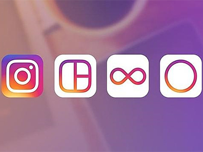
The redesign also extends towards the three applications owned by the social network: Boomerang (facilitates recording short videos), Layout (used to create photo collages) and Hyperlapse (creates fast motion videos).

As reported by the social network in its announcement, the new design improves how the App looks and feels, but without changing the navigation style that characterizes it. In addition, the App aims to put more focus on photos and videos.

Ian Spalter said that this redesign is a reflection of the different ways in which users of Instagram, Layoutt, Boomerang and Hyperlapse use the services. “We ask employees to describe  Instagram logo of in less than 5 seconds. Almost all obviated the rainbow, lens and viewfinder”, said design specialist.

What is curious is that in the middle of the vintage revolution that society lives, Instagram has decided to eliminate the retro air that characterizes the App since its launch in 2009.

Several social networks impact

Instagram users level of satisfaction has always been high, since the platform is dynamic and filters have been improving. What happened, then, that the App become object of criticism?

Social networks are sensitive, perhaps this is the reason why Instagram users does not applaud the new logo. Instead of this they express their rejection in other social networks like Twitter and Facebook.

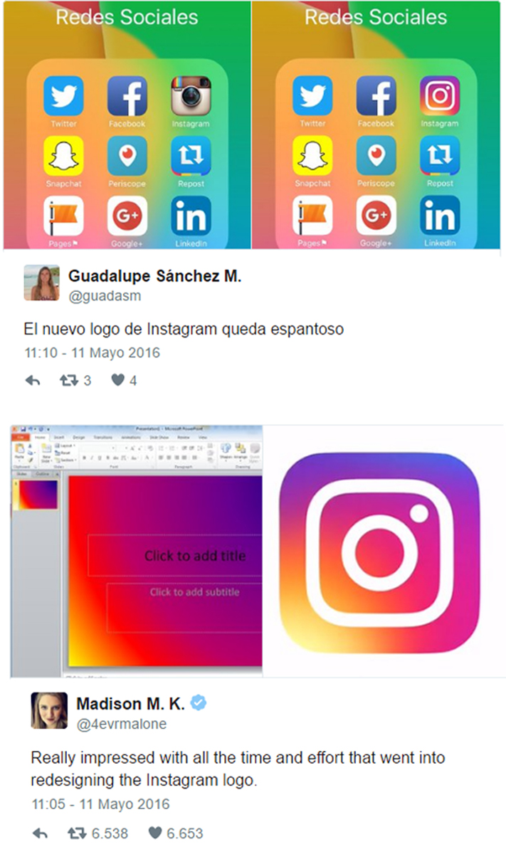
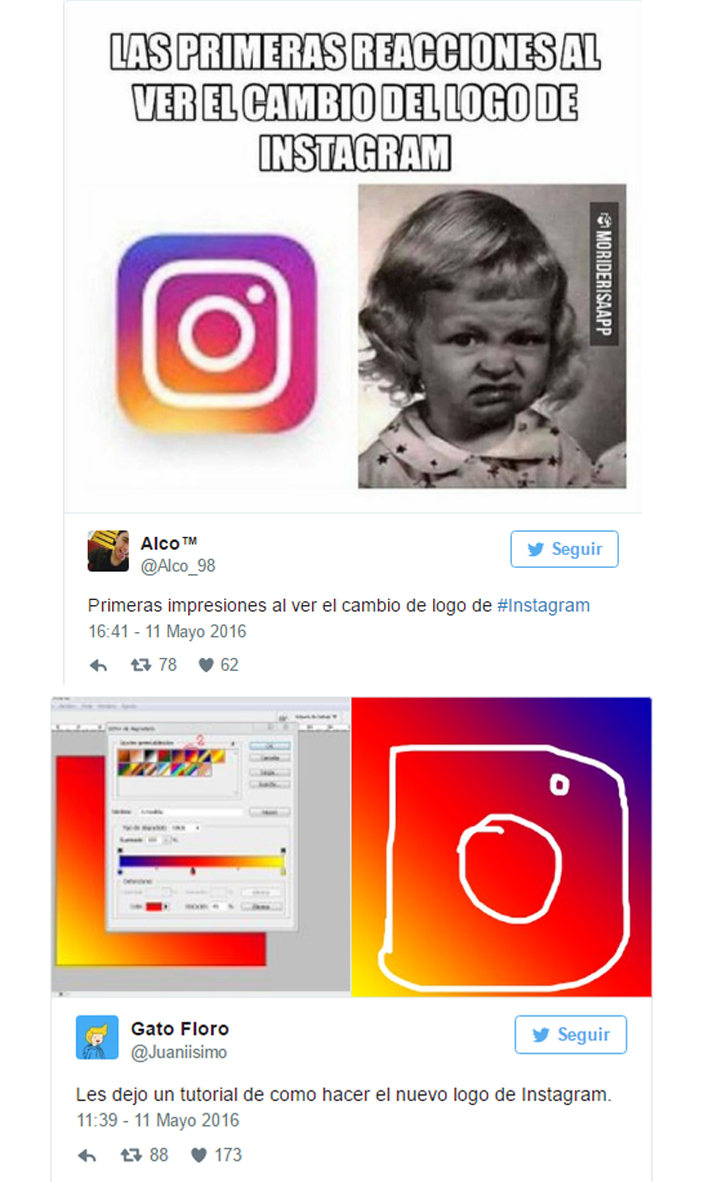
Users in social networks, especially on Twitter, were quick to express their opinion:

rediseño logo Instagram
rediseño en el logo de Instagram


What do you think about Instagram logo redesign?
Consult us about our Monthly Plan on Social Networks!

Key interfaces for your mobile site

site móvel

sitio móvil

What do your users want to do from their smartphone? That is the question that companies must do themeselves in order to understand their user’s needs. Focus on users experience is one of the keys to ensuring the success of a mobile site.

One of the common mistakes brands make is to assume that because they know from wich device the user is interacting with, they can predict the criteria they are going to use.

Another mistake is to assume that users only want to access content “important” to them, when what is “important” or “irrelevant” to the user constantly varies.

Finally, brands usually let UX machines take all the decisions on mobile sites. This is a work that should be carried out together by different areas, aiming to achieve the objective.

The question then is which are the most important  interfaces in a mobile site? These are:

  • Homepage

When a mobile site is opened, the user has to find everything easily. Calls to action should be highlighted and navigation menus should be easy to understand. There must be easy to go back home and promotions can not be intrusive.

The site should be optimized for mobile. This means that no clicking should be needed to zoom, there’s no need to use hyperlinks that open in new tabs, and other issues that complicate the user navigation.

  • Seeker

The Finder mobile site should be always visible at the beginning of the page and provide relevant results for the user. The use of filters can be of great help to guide users.

Choose neutral colors as wallpaper and highlight calls to action, as well as prices, reviews and stock, can help supplement the user experience.

  • Forms

Forms can be a source of success or failure. The important thing is to design it efficiently asking only essential information and guiding users along the way.

Forms:

-They must be brief and friendly.
-They must be tools to facilitate data entry (such as autocomplete).
-They must show when a field has been completed successfully.

In conclusion we mention that the homepage, the online search and forms are some of the interfaces users deal with , but are those that define the permanence of consumer mobile site and the success of your conversions.

Is the website of your company properly adapted for mobile?

Contact Us!

Abrir chat
¿Necesitás ayuda?
Agencia Marketing Online Way2net
Hola! ¿Necesitas una agencia de marketing online?
Escribinos!